Advanced reporting and dashboard functionalities for growing businesses
Stop running on gut feel dressed up in numbers. This is how 10 to 60 person businesses build reporting that drives decisions, not slide decks.
 By Ishan Vats · Founder of IV Consulting · 150+ ops transformations over 10+ years
Some links below are affiliate links. If you buy through them we may earn a commission, at no extra cost to you.
 CRMPipeline data
 OpsDelivery metrics
 FinanceRevenue + cash
 AlertHealth score < 55 fires
Advanced reporting and dashboard functionalities give a growing business real time visibility into the metrics that drive decisions, not just the ones that are easy to collect. They are built on a four layer architecture: raw data, standardised KPIs, role specific dashboards, and automated decision triggers. The payoff is faster decisions, fewer compounding problems, and revenue risk surfaced weeks before it becomes a loss.
The data blindspot
Why basic reporting breaks at scale
Most growing businesses have more data than ever, and less clarity than ever. Spreadsheets multiplying. Metrics siloed by department. Reporting built for last week's questions. If your leadership team is making critical decisions from a 10 day old export, you are not running a data driven business. You are running on gut feel dressed up in numbers.
There is a specific moment in every growing business when basic reporting breaks. The weekly update takes two people three hours to compile. The CEO asks what the retention trend is and nobody can answer confidently for 48 hours. Ops has one version of revenue. Finance has another. Sales has a third. All three are technically correct. None of them are useful.
This is not a data problem. It is a reporting architecture problem, and it is far more expensive than most founders realise. Three dynamics create the break point.
1. Decision volume scales faster than team size
A 30 person business does not make 6x more decisions than a 5 person business. It makes 30 to 50x more, because every additional team member, client, and process generates new decision nodes. Basic reporting cannot keep pace.
2. Data lives in too many places
CRM, project management tool, accounting software, Google Analytics, Stripe, support desk: each a separate island. Nobody is aggregating these into a single coherent view.
3. Reporting is backward looking by default
Most teams report on what happened. Advanced reporting tells you what is happening right now, and with proper leading indicators, what is likely to happen next.
The cost
3 reporting failure modes costing businesses 6 figures
These are not edge cases. IV Consulting sees all three in the majority of businesses we engage with between 10 and 60 people.
Failure mode 1: the lagging indicator trap
Your weekly report lands Friday afternoon. It covers what happened Monday through Thursday. By the time a problem is visible in a lagging report, it has often been compounding for 2 to 4 weeks. The cost of late visibility on operational problems runs between 90K and 180K per year for a 20 to 30 person business, in delayed interventions, lost clients, and reactive firefighting.
Failure mode 2: dashboard sprawl
Paradoxically, teams that invest in reporting tools often end up with too many dashboards. Marketing has one. Sales has one. Ops has a spreadsheet. Finance has their own system. Leadership has a slide deck compiled from all of the above. The result is not insight, it is noise. In our audits, the average 25 person business has 7 to 11 separate reporting artefacts being maintained across teams. Consolidating these typically saves 8 to 14 hours of manual compilation work per week.
Failure mode 3: the manual reporting tax
Every hour spent building a report is an hour not spent on the work the report is meant to improve. For a 25 person business spending 15 hours per week across team leads on reporting compilation, at a blended rate of 80 per hour, that is 62,400 per year in pure reporting overhead, producing no direct business value. Worse, manually compiled reports carry an average error rate of 12 to 18% due to formula mistakes, outdated data, and copy paste errors.
The model
The 4-layer reporting architecture for SMBs
Advanced reporting is not just better charts. It is a structured architecture with four distinct layers, each serving a different purpose in the decision chain.
| Layer | Purpose and output |
|---|---|
| Layer 1: Raw data | All inputs from operational tools, CRM, PM, finance, support. Not human readable on its own. Needs transformation. |
| Layer 2: Metrics and KPIs | Calculated, standardised measures derived from raw data. Single source of truth for each metric. Updated automatically. |
| Layer 3: Dashboards | Visual, role specific views of selected KPIs. Designed for daily and weekly consumption by specific stakeholders. |
| Layer 4: Decision triggers | Automated alerts and anomaly flags that prompt action. The system tells you when something requires a response, you do not need to go looking. |
Most businesses have Layer 1 (data exists somewhere) and a version of Layer 3 (someone made a dashboard). Layers 2 and 4 are typically missing, and those are the layers that create business value.
The playbook
7 advanced reporting and dashboard techniques
1. OKR-linked KPI architecture
Track outcome metrics linked directly to strategic objectives, not activity metrics like calls made or emails sent. Each OKR carries 2 to 3 KPIs as leading and lagging indicators. In our 2-hour KPI Architecture Workshop, any metric that cannot be tied to a decision is removed. Average cull rate: 40% of existing metrics eliminated.
2. Leading vs lagging balance
Lagging indicators tell you what happened. Leading indicators tell you what is about to happen. Maintain a deliberate 60/40 or 50/50 balance per functional area. Leading signals surface problems 2 to 4 weeks before churn.
3. Drill-down hierarchy
Three levels: executive summary with 5 to 7 headline numbers, operational drill down by team, and transaction level investigation. Click a revenue figure to see it by segment, then by account, then by delivery data.
4. Automated alert thresholds
Churn risk above 70 alerts the account lead. Pipeline coverage below 2.5x alerts the sales lead. Start with 3 to 5 critical alerts per team. Calibrate carefully: over alerting trains teams to ignore notifications.
5. Cross-functional unified views
A Revenue Health Dashboard combining sales pipeline, delivery capacity, and finance receivables gives leadership early warning of structural misalignment: selling more than you can deliver, cash tight despite strong revenue.
6. Cohort and trend analysis
Track client cohorts by acquisition month, vertical, and deal size; project cohorts by service line and team lead. Patterns become visible within 90 days and drive strategic pivots worth far more than any point in time view.
7. AI-augmented reporting
Modern platforms surface anomalies manual review would miss, generate narrative summaries, and flag leading indicators early. Clients using AI layers cut weekly interpretation time by 3.5 to 5 hours per senior leader.
The stack
Advanced reporting tools: the 2026 SMB comparison
The tool market has matured. Here is how the leading options stack up for 10 to 60 person businesses.
| Tool | Best for | Strengths | IV verdict |
|---|---|---|---|
| Looker Studio | SMBs on the Google stack | Free, powerful connectors, great for marketing and Google Analytics data | Best free entry point for Google stack businesses |
| Power BI | Microsoft ecosystem businesses | Exceptional data modelling, Office integration, AI insights | Best for teams already in Microsoft 365 |
| Tableau | Data mature teams | Most powerful visualisations, strong cohort tools | Best for 40 plus person businesses with a data lead |
| Metabase | Self serve BI on your own database | Fast setup, SQL friendly, great for ops teams | Best for product and ops teams with dev resource |
| ClickUp Dashboards | Teams already using ClickUp for PM | Native, zero integration, covers ops and project metrics | Best starting dashboard for ClickUp first operations |
The AI-augmented reporting stack in 2026
AI integration in reporting is no longer experimental. Automated metric narratives written by Claude or GPT-4 save 2 to 3 hours of report writing per week per senior leader. Anomaly detection flags statistical outliers 1 to 2 weeks earlier than manual monitoring. Natural language query lets team members ask questions in plain English without SQL. Predictive churn signals flag at risk accounts 4 to 6 weeks before lagging indicators show risk.
Across 14 IV Consulting clients who adopted AI augmented reporting layers in 2025 and 2026, average weekly reporting overhead dropped by 4.5 hours per senior leader, and average decision lag reduced from 11 days to 2.3 days.
The rollout
The 6-week advanced reporting framework
Week 1: Reporting audit and metric architecture
Inventory every existing report, spreadsheet, and dashboard. Catalogue who creates them, who reads them, and what decisions they drive. Apply the decision test: for each metric, ask what decision it informs and who makes it. Metrics that fail are eliminated. Deliverables: master KPI register with decision mapping, data source inventory, and stakeholder requirements by role.
Week 2: Data integration and single source of truth
Connect data sources to the reporting platform. Define metric calculation rules precisely: revenue recognised versus collected, deal stage definitions, NPS thresholds. Establish and publish the single source of truth for each KPI. No more competing versions of the same number. Deliverables: integrations live and validated, metric definition glossary published.
Weeks 3 and 4: Dashboard build by department
Build role specific dashboards following the hierarchy: executive summary, operational drill down, transaction level investigation. Each goes through a stakeholder review cycle before launch. Design principle: if a non analyst cannot interpret the dashboard in under 60 seconds, rebuild it. Deliverables: dashboards for all key roles, approval sign offs, and a viewing SLA.
Week 5: Alert configuration and automation
Configure threshold alerts for each critical KPI. Set up automated distribution: a weekly metric narrative emailed to leadership every Monday by 7am, no human compilation required. Test all alerts for accuracy and relevance. Deliverables: alert rules live, automated weekly report distribution running.
Week 6: Team training and reporting cadence
Train all dashboard users on navigation, interpretation, and escalation. Establish the cadence: daily pulse with 3 headline metrics, weekly department review, monthly cohort and trend deep dive, quarterly OKR review. Confirm manual reporting tasks eliminated. Deliverables: training complete, cadence calendared, overhead reduction measured.
Proof
How a 24-person firm found 310K in invisible revenue risk
IV Consulting engaged with a 24 person management consulting firm in late 2025. The firm had grown from 8 to 24 people over 18 months and was experiencing what the MD described as flying blind at altitude. Reporting overhead ran 18 hours per week across 4 senior team members. Decision lag averaged 11 days. Finance, delivery, and BD each had a different revenue figure. There was no systematic early warning for churn, and the reporting state was 7 separate spreadsheets, one Notion page, and a slide deck.
The intervention
- ClickUp Dashboards for delivery metrics: utilisation, milestone adherence, action item age.
- Looker Studio for revenue and client health, connected to HubSpot plus Xero.
- Automated Monday morning CEO brief: 6 headline metrics emailed at 7am weekly with AI generated commentary.
- Client health scoring model: a composite of engagement frequency, deliverable adherence, and NPS trajectory.
- Churn alert threshold: a health score below 55 triggers automatic account lead notification.
- Metric arbitration: a single source of truth established for revenue recognised, pipeline, and utilisation.
| Metric at 90 days | Before | After |
|---|---|---|
| Weekly reporting overhead | 18 hours | 3 hours (review only) |
| Decision lag | 11 days | 2.1 days |
| Revenue figures in play | 3 competing | Single source of truth |
| At-risk accounts identified | 0 per month | 2 to 3 per month, 4 to 6 weeks early |
| Client retention rate | 74% | 88% |
| Revenue protected | 0 | 310K in at-risk ACV retained |
This firm did not have a revenue problem. It had a visibility problem. The reporting upgrade did not create performance, it revealed it. Projected ARR uplift from retention improvement and senior time redeployment: plus 245K. Visibility is not a reporting function. It is a revenue function.
FAQ
Questions leaders ask before they upgrade
How is advanced reporting different from just having more dashboards?
Do we need a dedicated data analyst to implement this?
How long does it take to see ROI from a reporting upgrade?
What is the single most important thing to get right in dashboard design?
Our team will not look at dashboards even when we build them. How do we fix adoption?
How do we handle reporting across multiple systems without a data warehouse?
Ishan Vats
Founder, IV Consulting · operations & systems consultant
I build operating systems and automations for growing teams. 150+ ops transformations over 10+ years. If you want yours mapped and built right, I'll do it with you on a free call.
Book a free strategy call →Keep reading
Related guides and work
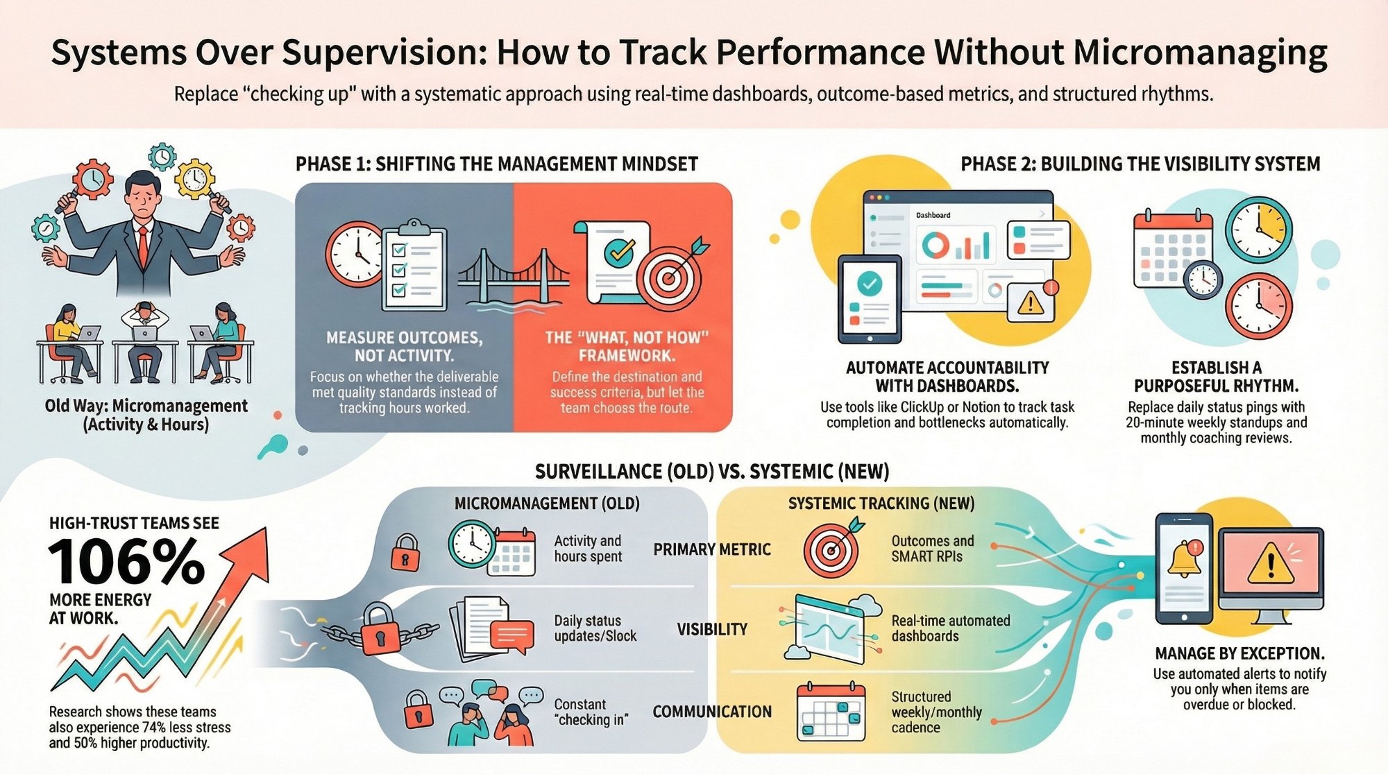
How to track team performance without micromanaging
The metrics that show real progress, without turning your dashboard into surveillance.
Read the guide →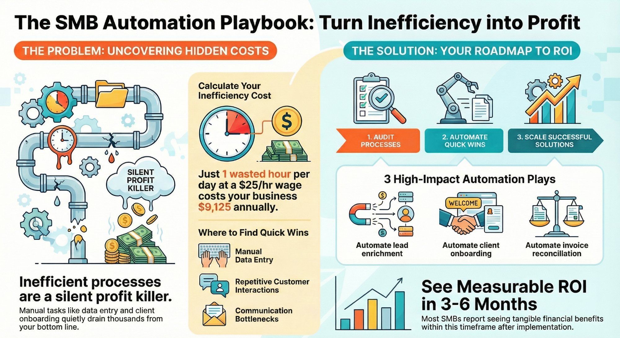
How much are inefficient processes costing your SMB?
Put a real number on the hidden tax of manual work, then fix it fast.
Read the analysis →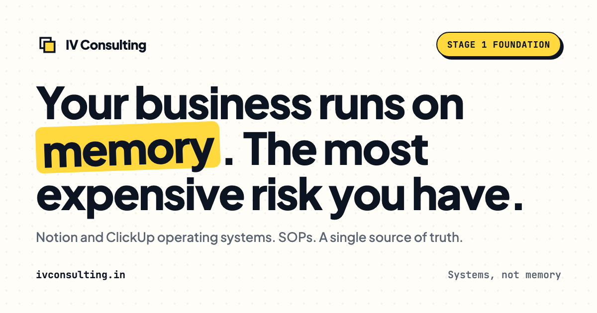
The Foundation stage, built for you
Your metric layer and dashboards designed and built so your team runs on one source of truth.
See the offer →Want your automation stack built for you?
Book a free 30-minute strategy call. We will map your highest-ROI workflows and give you a build roadmap on the spot. If we are not the right team for you, we will say so and point you somewhere better.
Book a Free Strategy Call →Free 30-minute call. Honest take, even if that means "you do not need us yet."